
One important consideration is colour palette – and architecture firms are dedicating more time, effort, money and expertise into ‘bushy greens’, ‘mango tangos’, ‘cowardly custards’ and ‘rusty reds’ than ever before.
As one of the Pacific region’s most prestigious design awards programs, across seven categories the Dulux Colour Awards recognise the exceptional and innovative use of colour in the built environment.
Eighty-three projects this year were chosen as finalists from a record 527 entries, and were judged by five design industry professionals from Australia and New Zealand.
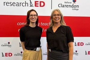
Amongst the finalists were five education sector projects, from Macarthur Anglican School, south of Sydney, Good Samaritan College in Toowoomba, Macarthur St Primary School in Ballarat, Aireys Inlet Primary School on the Victorian coast, and Wangaratta District Specialist School, also in Victoria.
They broadly demonstrated how design can be used to create a stimulating and comfortable learning environment, and how nuanced shades of colours are being used to create highlights, details and contrasts.
Most importantly, human-centred design is at the heart of each of the projects, with spaces created and tailored specifically for the people who will use them.
In this special feature, EducationHQ takes a closer look at two of 2024’s finalists...
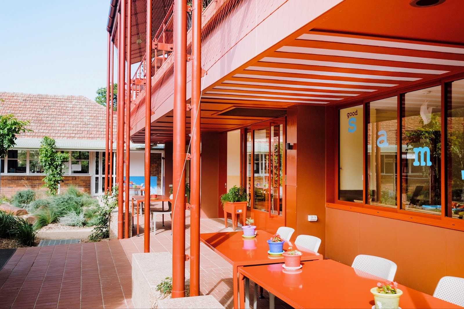
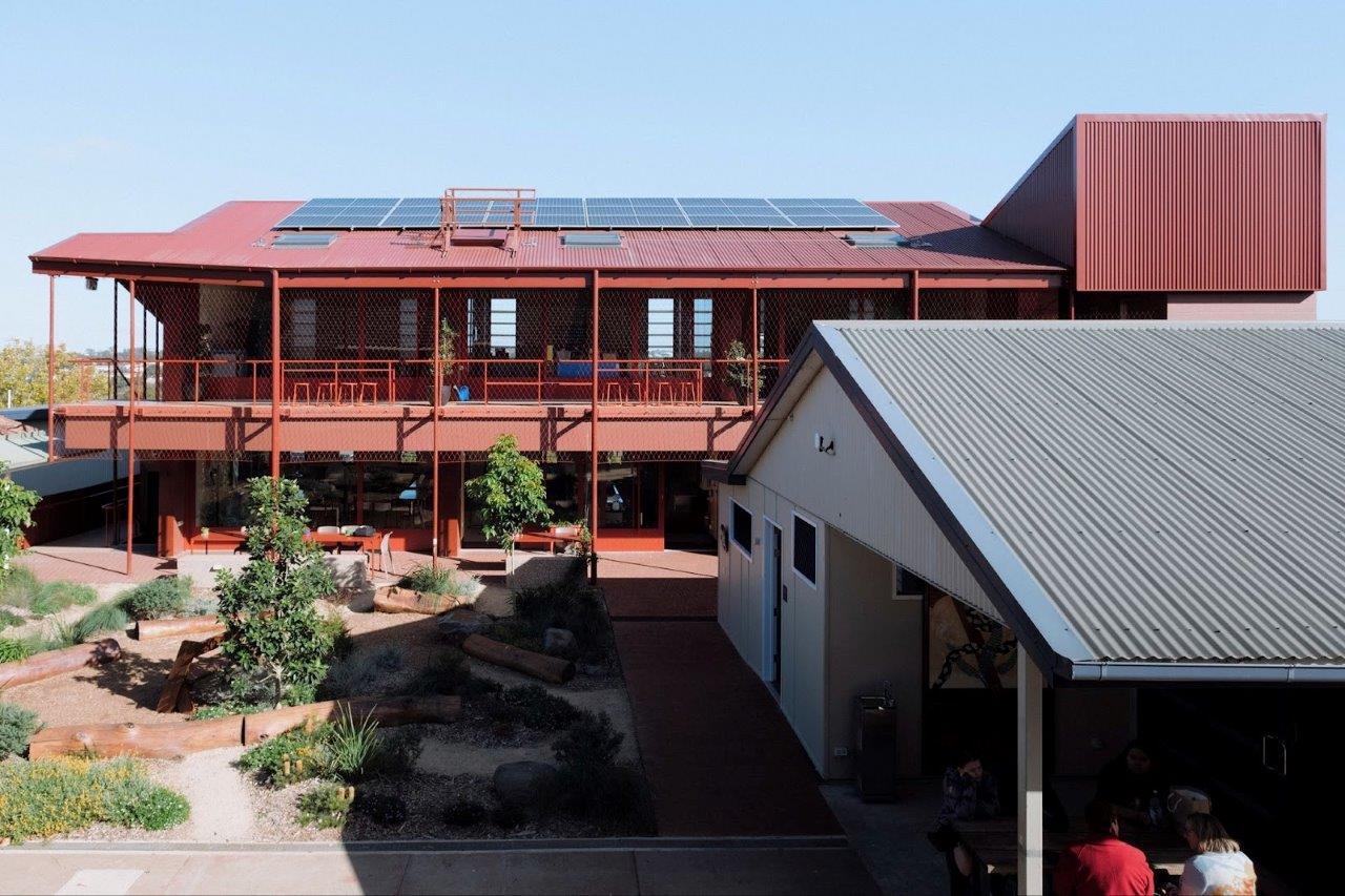
Good Samaritan College Polding Place
Finalist: Commercial & Multi-Residential Exterior category
Architect: Speculative Architecture
Good Samaritan College provides a unique learning environment and customises educational experiences for 70 students, all of whom are vulnerable young people who have not thrived in mainstream settings.
A trade-focused college with 17 staff, it offers certificate courses in hospitality, furnishings and automotive, and contains classrooms, food technology teaching spaces, with a commercial kitchen, cafe, and a design technology workshop.
Along with a colour overhaul, a $2.9 million Federal Government grant has seen the construction of new classrooms, a uniform store and a commercial kitchen at the school.
Principal Libby Rosentreter says the new spaces have revolutionised the way the school is able to operate.
“The kitchen has become the heart of the school which was exactly what we were after,” Rosentreter tells EducationHQ.
“We meet at the start and end of every day in this beautiful space which welcomes the outside spaces in, and having a space that affords us the ability to gather to prepare and share a meal together is invaluable.
“The new classrooms again welcome the outdoors in and have a light, calm atmosphere which is conducive to great learning.
"We love the unique look of the building and think it’s a fantastic and apt nod to the fact that we are doing schooling differently.”
The external paint colours were selected in relation to the site context, and so the unique geology of Toowoomba, with its red ferrosol soil, was referenced through the colour selections of Manor Red, Strong Strawberry, Reddy Brown, and Intensity Desert.
The continuity of the colours creates a spatial sensibility with the existing heritage, reddy-brown brick and tile, buildings that form the courtyard, and along with reddish pavers, these paint finishes are robust against the staining of the red soils.
Speculative architect Dirk Yates, who lives in Brisbane, but grew up in Toowoomba, says one of the remarkable things for visitors to Toowoomba is the ferrosol soils.
“It’s incredible to see that remarkable (red) colour and so part of [what we considered when determining the colour palette] was looking at the foundation buildings, but also the ground that we’re working on and how that, maybe, gave a sense of identity to the school, as opposed to what might be going on in a different place,” Yates tells EducationHQ.
He says part of good design in this case is giving coherency and consistency with what’s already there.
“So I think that’s one of the things that is exciting about it, I guess, in some ways, is trying to ensure the buildings have ‘a friendly relationship’, I guess, with older buildings, not necessarily saying ‘that’s in the past, this is something flashy and new’.”
Rosentreter says the red exterior of the building was initially of some concern to her, however Yates, she says, was ‘spot on’ when he explained that once the gardens became established and the vines began to grow up the netting on the building, the building would settle into the background due to the soil-inspired colour of the building and the surrounding buildings and landscapes.
“As time has passed, the building increasingly feels like it is settling into the earth – it truly has been a life-changing addition to our college,” she says.
The architect also wanted to enhance the quality of the café to have a semi-professional atmosphere in which students could practice their hospitality skills.
“We wanted the food technology space to feel a bit more like a space where you might have your auntie or your uncle or your dad show you how to make cookies, or how to make a simple stir-fry,” Yates says.
“But also a spot that you could do your homework after school or make a Mother’s Day card, push all the tables to the side and have a bit more of a meeting or a gathering, or bring all the tables together and have shared meals, which they they do in that space.”
Interestingly, many of the colours chosen were done so based on their name.
“So it’s based on the idea of making a trifle, or making a trifling story,” Yates explains.
“So there are colours like Cream Cake, Cowardly Custard, Peach Melba, Vanilla Ice Quarter, Cheesy Grin, these kinds of things that the students wouldn’t necessarily see them and go, ‘that’s Mango Tango’, but the teachers share a story about how those colours came about that’s beyond just an architect picking a colour and thinking that looks good.”
Rosentreter says given many of the school’s young people are neurodiverse, getting the environmental aspect of the build right was hugely important.
“For neurodivergent young people, colour has been shown to play a huge role in influencing mood, focus and even behaviour,” she says.
“Dirk was responsive to my thoughts about this and how colour can make a huge impact on a neurodiverse students’ capacity to remain calm, well-regulated and engaged."
The principal says across the board, the colour scheme chosen for the internal and external spaces has received pleasing feedback from the students.
“We think that the colour scheme reflects beautifully who we are as a community and where we are located,” she says.
“It contains the red tones of the ferrosol soil of the Darling Downs, which bring cohesion to the site, blending with our existing historical buildings on site. The classroom colours also acknowledge our local quarry, plants and soils.”
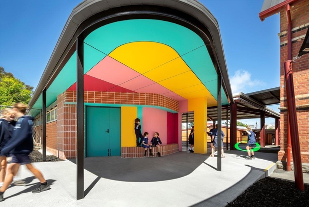
Aireys Inlet Primary School
Finalist: Commercial Interior Public & Hospitality
Architect: Sibling Architecture
Aireys Inlet Primary School has a cohort of 72 Prep to Year 6 students, with seven full-time teaching staff and a number of teacher aides and others on site during the week.
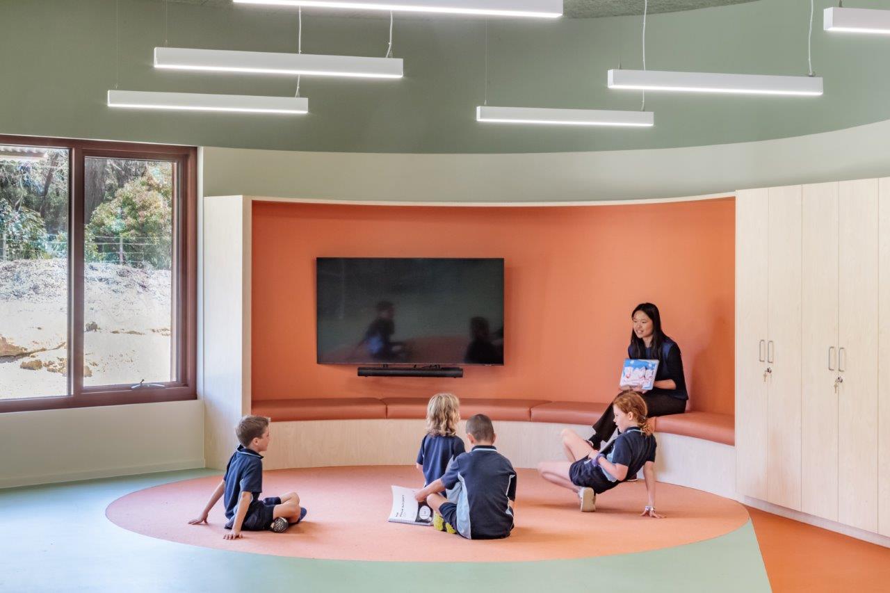
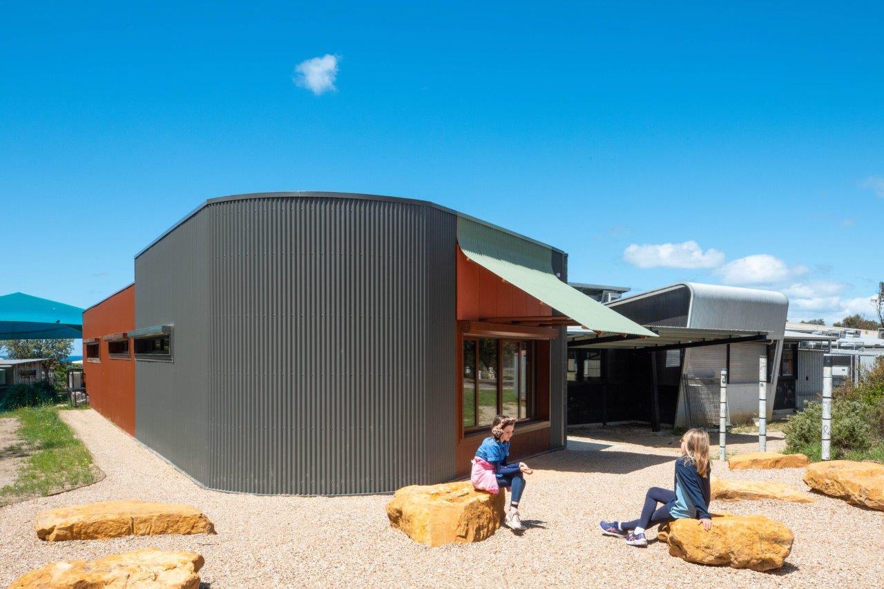
The public school’s Art and Music Hub project, one of three projects to receive a commendation in their category, was conceived as a harmonious convergence between the Australian bush and the Southern Ocean, evident by its location on the Great Ocean Road, and embodying the school’s core values of environmental appreciation and artistic expression.
Architect Nick Braun says situated atop cliffs above the ocean, the school “really does have this where-the-bush-meets-the-ocean quality to it”.
“I guess that was really the driver in terms of the colour palette – looking at the natural picturesque landscapes, and there’s a nature reserve on the site as well that has native yam daisies,” Braun explains.
The different colour palettes outdoors have influenced the external palette as well as the indoors too, he says, along with important input from school representatives and the area’s Wadawurrung traditional owners.
The textured external blockwork, red fibre cement cladding, and green Colourbond sun shading awning were chosen to resonate with the local environment, ensuring a visual dialogue between the new structure and its context.
Internally, paints were specifically chosen and used to further reinforce this idea, with bushy greens and vibrant yet soft oranges inspired by Australian bush flowers, eucalyptus leaves and local ocean corals, creating a visually stimulating and calming atmosphere.
The re-examining walls instead of being painted in a bright white are all treated in an earthy white to further add to this softening effect.
“Part of that philosophy of positive places is also having inspiring places for students to learn, and you go into so many schools these days, where the palettes of the spaces is quite bland and monotonous, and so we really try to work against that to create these quite vibrant and uplifting spaces that just put you in a positive mood,” Braun says.
“I guess really that in itself can begin to aid learning through the spaces, and just create probably the sort of subtle connections as well to things like nature without kind of necessarily being directly referenced, if that makes sense.”
The school’s principal, Jennifer Abel, says when she and her team were thinking about the colour, particularly in the art space, they wanted to have that bush feel come into the space and embody the school’s core values of environmental appreciation and artistic expression.
“And I think we did that beautifully,” Abel tells EducationHQ.
The school leader also says in the back of their minds, they wanted to keep the colour relevant for their local Wadawurrung people.
“We used lots of orange and terracotta and black and yellow and picked a palette that we were able to match with soft furnishings and a really lovely Aboriginal print on the couches and some of the other furnishings. It just made the whole room pop,” Abel says, proudly.
“So when the kids came in, they were so excited because the space was visually stimulating and enhancing.”
The hub’s design is not only responsive to the initial brief but goes beyond by incorporating additional features that enhance the learning and teaching experience, including an external rock garden.
The flexibility of the space caters to diverse user needs, ensuring that the hub becomes a dynamic and inclusive space for artistic expression and education.
“It’s a space that really enhances creativity – with its really nice, vibrant colours and being able to bring the outdoors in, as well to enhance their creativity and their thought processes in the production of artwork and music.”
Braun says his firm is enjoying working in the education space, and wants to provide inspiring places for students to learn.
“…we’ve been back quite a few times, and I think the school community have really embraced the project and have really enjoyed working in it.”
He says the art room particularly has been a big success, and that has filtered throughout the whole school.
“I think that really is a positive aspect of the architecture and I think they’re enjoying it. Well, I hope they are,” he laughs.
The judging panel for the 38th Dulux Colour Awards comprised Shaun Carter, founder of Carter Williamson; Monique Woodward, co-founder of WOWOWA Architecture; Eva-Marie Prineas, founder of Studio Prineas; Nick Travers, co-director of Technē Architecture + Interior Design; and Sarosh Mulla, director of Pac Studio.