

I’ll confess upfront: I’ve been there. I’ve fallen down the themed-classroom rabbit hole more than once. Rainbow era? Guilty. Matching labels? Absolutely. There is something deeply satisfying about a beautifully styled room that feels warm, intentional, and ready for learning.
But here’s the quieter question worth sitting with:
What purpose are all these displays and decorations actually serving?
This isn’t an argument against caring about classroom environments. The spaces we create matter. They communicate safety, belonging, and purpose.
But research suggests that how an environment supports thinking matters far more than how photogenic it looks. Some design choices support focus, memory, and self-regulation. Others, despite the best intentions, quietly compete for students’ attention.
In this piece, I want to move beyond aesthetics and into thinking. Drawing on research and lived classroom experience, I’ll unpack what we know about environments that genuinely support learning and share practical ways to design classrooms that feel calm, organised, and supportive, without draining your time or energy.
(Bonus: there is a free download at the end to help you make these shifts).
What does the research say about classroom environments?
This is where things get interesting – and a little uncomfortable.
For years, many of us (myself included) have worked from a well-intentioned belief: more colour, more visuals, more displays must equal more engagement and better learning.
After all, vibrant classrooms feel warm, welcoming, and alive. For many teachers, particularly early in their careers, the classroom becomes a visible expression of care, effort, and professionalism.
The problem is that when intuition meets evidence, this assumption starts to wobble.
Research consistently shows that visually busy classrooms compete with students’ attention rather than support it. In highly decorated rooms, children spend more time off-task, with their attention repeatedly drawn away from instruction and towards wall displays, even when those displays are familiar and unchanged.
Crucially, repeated exposure does not solve the problem. The brain does not simply ‘tune out’ visual clutter - distraction persists as a constant, low-level drain on attention.
From a cognitive perspective, this matters because learning relies on working memory, a system that is limited and easily overloaded, particularly when students are learning something new.
When the environment adds non-essential visual information, it increases extraneous cognitive load - mental effort that does not contribute to learning and reduces capacity for understanding and retention.
Large-scale evidence suggests these effects are not trivial. Barrett et al. (2017) found that environmental factors such as visual organisation, layout, and light accounted for up to 16 per cent of the variation in student learning outcomes, a contribution comparable to well-established instructional influences.
More recently, dos Santos (2025) argues that classroom design remains largely disconnected from what we know about how the brain processes information, with visual overload a central concern.
Importantly, this burden is not evenly shared. While all students experience increased attentional demands, the impact is felt more acutely by more vulnerable learners, including those with attentional or sensory sensitivities, language or learning difficulties, and younger students still developing self-regulation.
Design choices that increase extraneous cognitive load disproportionately affect students who have the least cognitive ‘spare capacity’ to give.
This is not a call for sterile classrooms. It is a call for intentional ones. The question is not whether environments matter, but whether they are helping students think – or quietly competing for their attention.
What about displays? I don’t want my classroom to feel ‘sterile’…
Let’s clear something up first. Calm does not mean bare.
A classroom can be organised, intentional, and cognitively supportive without feeling clinical. If we want ‘Pinterest brains’ - brains full of colour, motion, ideas, and connections - then the space students look at most often needs to be doing the least.
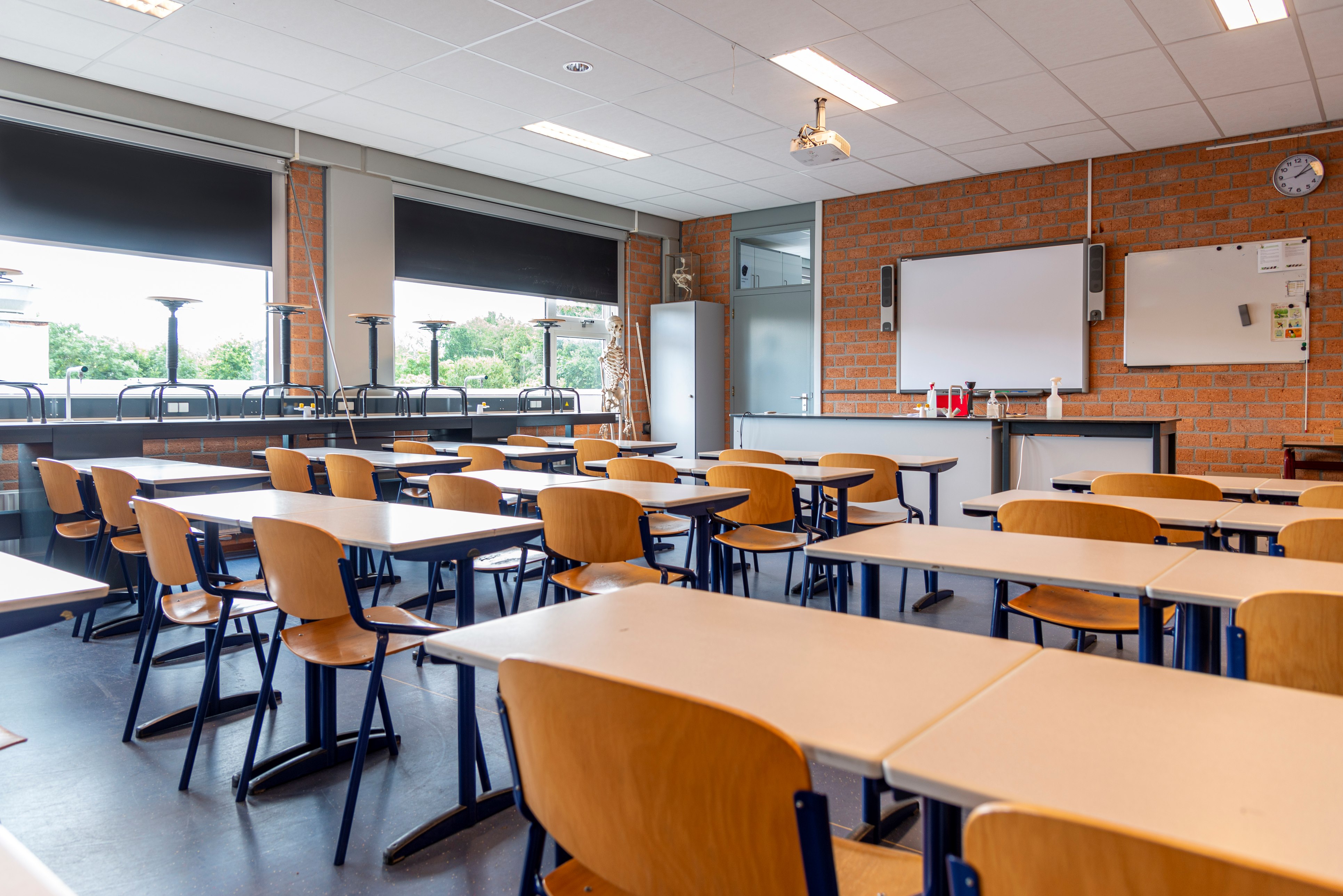
Front of the room: protect thinking
Treat the wall students face during instruction as a cognitive anchor, not a gallery.
Keep this space visually calm and deliberately sparse.
Include a clear, well-organised visual timetable that can be interpreted at a glance.
Limit anchor charts to those that:
- are explicitly referenced during teaching;
- are used during explanation and modelling;
- are removed once they are no longer instructionally necessary.
Anchor charts should earn their place. If they are not actively used, they quickly become visual background noise rather than learning support.
The goal here isn’t deprivation. It’s precision. When the front of the room is calm, students have more cognitive space to build rich internal “Pinterest boards” in their minds, rather than being distracted by external ones.
Back and side walls: minimal, but personalised
You do not need to plaster every available surface with student work! A few calm wall hangings or thoughtfully chosen images can add warmth and personality.
These elements may also support acoustics, particularly in rooms where sound carries.
Think of these walls as shaping the emotional tone of the room, not competing for attention during teaching.
When you do display student work, make it easy (future you will thank you!)
Be selective about where student work is displayed. Invest in low-effort, high-impact display systems, such as:
- Clipboards Velcro-dotted to the wall;
- Simple frames or display pockets with student names already attached.
This allows work to be swapped out quickly as learning progresses. Future you – exhausted and watching the clock – will thank you for systems that don’t involve another round with the laminator and staple gun.
Easy displays mean you can close the door, leave on time, and reclaim your afternoons.
Floor and mat areas (especially for younger students)
Keep these spaces clear, calm, and uncluttered.
Ensure shelves, tubs, and loose items are out of reach or visually contained.
The mat area should quietly signal: this is a place for listening, thinking, and shared attention.
Considering the line of sight to the front of the room
Ensure all students have a clear line of sight to the board and teacher.
Avoid hanging displays across the room or using tall furniture that interrupts visual focus.
What about furniture layout? Start with how you teach.
If your teaching is explicit, structured, and responsive, your furniture layout should quietly support that - not work against it.
Prioritise desk pairs (with flexibility built in)
Desk pairs work beautifully for explicit instruction, supporting easy partner talk, quick checks for understanding, and low-friction collaboration without the chaos of constant group reshuffles.
Be intentional about pairing, not just placement.
Avoid layouts that require students to twist or crane to see key visuals.
A simple bonus: pairs can quickly become small groups by turning to face the pair behind them, without moving furniture or losing momentum.
Protect movement - for you and for them
Ensure clear pathways so you can move freely, provide in-the-moment feedback, and scan and respond quickly.
Students should be able to access resources or exit the room without disrupting others.
Partner talk should not require scraping chairs or reconfiguring the room.
Resist the urge to over-furnish
More furniture does not equal more functionality. Every additional piece takes up physical space and visual space. Ask yourself whether each item genuinely supports teaching, learning, or movement.
*A quick note on teacher desks: large, cumbersome desks often anchor teachers to one spot and consume valuable floor space. If you need a desk, consider a small, portable option or position it outside the main teaching zone. When you’re teaching explicitly, you’re rarely sitting behind a desk anyway.
A simple rule of thumb: If your layout allows you to teach, move, notice, and respond with ease, and allows students to sit, turn, move, and focus without friction - you’re probably on the right track!
Furniture should fade into the background so learning can take centre stage.
Colours, décor, and organisation: calm spaces support busy brains
The visual and organisational choices we make in classrooms quietly shape attention, regulation, and cognitive load.
Research suggests that natural colours, textures, and visual connections to nature are associated with lower stress and improved comfort and attention in learning environments.
Aim for a base palette of soft blues, greens, and earthy tones, with natural materials where possible.
Use colour sparingly and deliberately to draw attention to what matters most.
The same applies to labels: simple, minimal designs often create far less visual noise than heavily themed alternatives.
Décor with purpose
Decorative elements should earn their place by adding calm, warmth, or instructional value.
A few thoughtful inclusions are often enough: a globe you regularly use, tidy shelving with predictable organisation, or a small number of nature-inspired wall hangings.
Plants can help soften the space and support regulation; even artificial plants can provide visual relief if maintenance is a concern.
Organisation that streamlines
Use a clear system for storing student work (trays, tubs, or magazine holders organised by subject) to streamline collection, checking, and return.
If students have desk trays, I recommend you keep them for essentials only (mini whiteboard, marker, basic stationery); store all other work centrally. This helps maintain order and access to student work.
Side note: desk trays benefit from a regular reset (Friday works well). For younger students, simple monitor roles for shared resources help maintain order and build responsibility.
A visually calm, well-organised classroom reduces unnecessary cognitive load, supports regulation, and makes day-to-day teaching smoother – with the added bonus of keeping your classroom running efficiently – this protects our cognitive load too!
Light and noise: clarity supports thinking
Light and sound quietly shape how effortful it is for students to attend, listen, and think.
- Prioritise natural light and reduce glare where possible;
- Be mindful of harsh or flickering fluorescent lighting;
- Reduce reverberation with simple sound-absorbing additions such as rugs, fabric noticeboards, or soft wall hangings.
In acoustically challenging rooms, a teacher voice amplifier can dramatically improve clarity and protect teacher voice.
The goal isn’t silence or perfection. It’s clarity. When students don’t have to strain to see or hear, they have more cognitive capacity available for thinking and learning.
Planning for ‘Pinterest brains’
Here’s the quiet shift this whole conversation is really pointing toward.
For many of us, hours have traditionally gone into elaborate displays, themed borders, colour coordination, and visual polish. While those spaces can look beautiful, both research and lived experience keep nudging us in a different direction.
What if that same time and energy were redirected?
Time spent laminating becomes time spent sequencing learning based on what students already know and what the data says they need next.
Time spent styling walls becomes time spent sharpening explanations, examples, and models in response to what students are getting – and what they’re not.
Time spent perfecting displays becomes time spent designing learning that builds rich knowledge and stretches students toward increasingly complex skills.
This is the heart of planning for ‘Pinterest brains’. Brains that are full of colour and motion - not because the walls are shouting at them, but because their internal worlds are expanding. Brains that are building rich mental images, meaningful connections, and durable knowledge about how the world works. Brains that are being lifted by stories, ideas, language, and understanding - much of it completely invisible from the outside.
A calm, intentional classroom does not compete with learning. It gets out of the way so learning can happen.
And while a Pinterest classroom might earn compliments in Week 1, a Pinterest brain is something far more powerful. A child who can see more, think more, connect more, and carry that knowledge forward long after the posters come down.
The real Pinterest boards belong in students’ minds, not on the walls.
You’ll find a FREE checklist linked here to help you reflect on how your classroom currently supports learning, and to identify small, meaningful areas for improvement.
This article was first published on the author's Substack. Read the original post here.